Reading...
![]()
Play button
![]()
Play button
![]()
Use LEFT and RIGHT arrow keys to navigate between flashcards;
Use UP and DOWN arrow keys to flip the card;
H to show hint;
A reads text to speech;
11 Cards in this Set
- Front
- Back
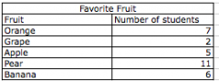
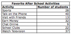
Draw a picture graph to represent this data.
|
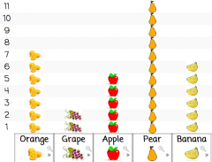
Graph may be drawn horizontally or vertically.
|
|

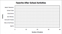
According to this graph, how many more students like Sports than School Clubs?
|
6
|
|
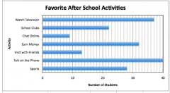
According to this graph, how many fewer students like to chat online than talk on the phone or visit with friends?
|
44
|
|
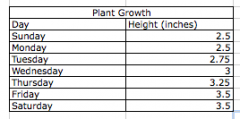
Draw a line plot to represent this data. (step 1)
|
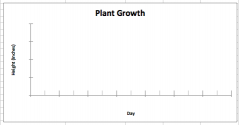
Step 1- draw and label a set of axis. Don't forget the graph title.
|
|

Draw a line plot to represent this data. (step 2)
|
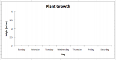
Step 2- Create a scale that fits the given data. Label the X axis with the day and the Y axis with the appropriate scale. Here, a 0.5 increment starting at 2.0 and stopping at 4.0 is appropriate.
|
|

Draw a line plot to represent this data. (step 3)
|
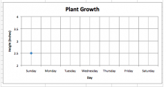
Step 3- plot the first data point.
|
|

Draw a line plot to represent this data (step 4)
|
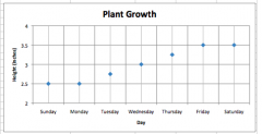
Step 4- plot each data point carefully
|
|

Draw a line plot to represent this data. (step 5)
|
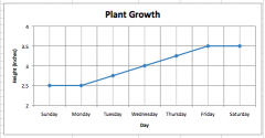
Step 5- connect the data points with a line from one point to the next.
|
|

Create a bar graph to represent this data (step 1)
|
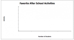
Step 1- Draw and label a set of axis. Don't forget the graph title.
|
|

Create a bar graph to represent this data (step 2)
|
Step 2- Create a scale that fits the given data. Label the x axis with your scale and the Y axis with the categories. Here a scale of 1 starting at 0 and going to 40 is appropriate. It is appropriate to label every 10 increments.
|
|
Create a bar graph to represent this data (step 3)
|

Step 3- Draw the bars to represent each of the categories.
|